Las Cuatro Construcciones


Aims – The requirements for this project are: Abstract theme – 4 contrasting versions; Minimum A3 size; Supporting statement 2 A4 pages ; Series of 4 prints
Introduction – “The line conquered everything”
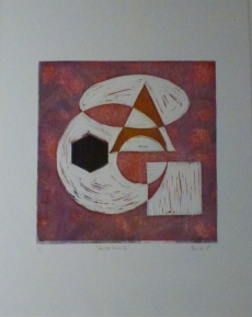
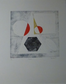
In 1920-21 Rodchenko designed six constructions using the following shapes, folded into a horizontal plane:
- 2 circles
- a hexagon
- an oval
- a triangle
- a square
He repeated this system of production in a series of works to explore I used this system of composition in a print edition I made for the IPE (International Print Exchange) using collagraph and stencil processes.
I wanted to explore this again and develop the idea into my final series of prints on a theme.
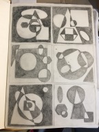


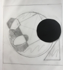
I worked from the original drawings I produced and developed them further into a series of traced drawings using a ruler and compass. I was interested in using a system of geometric forms to express an idea several times to attempt to find compositions that worked in print form.
The first prints (proofs) were printed in black ink to check on the carving of the lino.


I also tried printing them on magenta paper.


And then in red..


After that, I went back to the original drawings and added some colour.
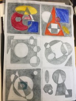
The colour scheme I had used for the collagraph was what I might consider a typically ‘modernist’ palette – grey, dark red, orange, green and navy. For the previous, project I had been looking at the colours of the Concrete Cuba artists to further reference 1950’s abstract art but I also wanted to reference the Russian Constructivist aesthetic of red, white and black.
I tried a version where I masked off areas of one of the prints and inked up using different coloured inks. This eventually became this print
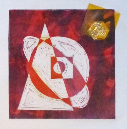
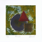
This print was used with a monoprint and a gold leaf chine colle. Thinking of titles I wasn’t sure whether to name the prints after cities I have lived in; or colours, perhaps leave them untitled? Whilst looking at the print samples again I thought this one reminded me of a rocket, or an atom, either way, it seemed connected to the space race and its origins in the mid 20th Century. I named it Accelerate.
For the other prints in the series, I worked with a similarly limited colour palette and masked areas off to introduce different coloured shapes. I also used chine colle and mono printing to try and give each print a life of its own.
Here are the final prints, in order.
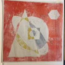
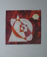
Satellite
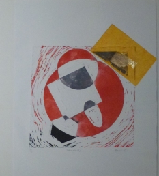
Daughter
Accelerate
Soar
I am fairly happy with these prints although I can see they have room for development. I am interested in the play of the shapes which make each composition. I feel that they are printed to a good standard and have elements of my own voice starting to develop. They, like me, are a work in progress however and I am looking forward to further experimentation with layers of colour, overprinting, and revisiting them once I have the chance to get back into my studio. I want to move the square around on the picture plane, perhaps printing diagonally, and using stencil shapes to create more interesting prints. Time has always been an issue for me during this course and this assignment was no different. I am inspired however by my fellow artist Laine Tompkinson who works and reworks her prints, adding layers of colour and different print techniques, paint and collage to create her work. The work produced for this course has given me the foundations to begin that process of developing my ideas into more considered prints and even mixed media pieces.

One thought on “Project 15 – Developing a series of four combination and experimental prints”